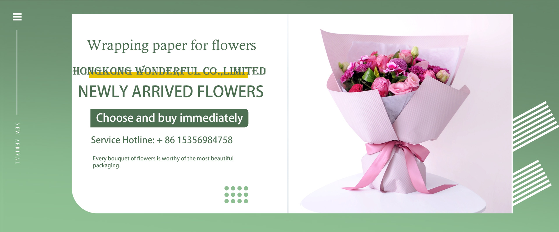
The color matching of flower wrapping paper is exquisite.
Published by Publisher: HONGKONG WONDERFUL CODate: 4/10/2024 10:24:57 PM Read: 909 A bouquet of exquisite and beautiful flowers requires matching wrapping paper in addition to the color harmony and exquisite creativity of the flowers themselves. If the packaging is too bright, it will steal the limelight of the bouquet, and if the packaging is too casual, it will reduce the grade of the bouquet. The material and color selection of the wrapping paper is a very important skill. How to choose the right wrapping paper according to the flowers among all kinds of wrapping paper? Let's take a look at some common color matching methods.
Collocation of the same color and similar color.

Features: unity, harmony and softness.
It is usually easier for people to accept and recognize the collocation of the same color, which is more visually coordinated. But this kind of collocation is not easy to stand out, giving people a popular, insipid feeling. We can use flowers with the same hue and different brightness to change the visual mediocrity, while maintaining the unity and coordination of color collocation to create a sense of softness and harmony. For example, dark green and light green, orange and coffee and other similar combinations of colors.
Collocation method:
The color of the packaging paper is consistent with or similar to the color of flowers, and can not be more bright than flowers, except white, otherwise it is easy to dominate. For example, when choosing bright flowers such as bright red and bright yellow, the wrapping paper can choose similar but different colors such as light red and light yellow, and dark flowers can be matched with dark wrapping paper.
Contrast color collocation.
Features: strong, eye-catching, bright, jumping, strong visual impact.
Contrast color matching has a strong visual impact, full of changes, can highlight the color and characteristics of the bouquet. The frequency of use is higher in occasions with personality and hope to attract attention, but the use of contrast colors should be moderate, otherwise the colors are easy to conflict and produce a sense of disharmony. In the choice of packaging paper, you can choose a relatively dark, weak jumping color. If the color of the flower itself is dark, it is best not to use the contrast color matching method, otherwise it will appear that the bouquet is darker and can not bring people the sense of pleasure that the bouquet should have.
Collocation method:
Red and green, yellow and purple, orange and blue are all complementary colors with strong visual effects. This kind of color combination is easy to give people a lively, lively, fresh and comfortable feeling, but they should be careful when matching. Otherwise, it is easy to produce a sense of vulgarity and disharmony.
Universal color collocation.
Features: fashionable and convenient.
Universal color means that some colors can be matched with any other color without producing disharmonious and vulgar visual effects. Universal color is a very convenient and applicable color, no matter what color it is, novice florists can rest assured to use it.
Collocation method.
Green, khaki, black, white, gray and other colors are universal colors in the bouquet. The vast majority of plant leaves are green, and the use of green in flower art is harmonious; khaki is a mixture of red, yellow and blue, which is the most compound of all colors, giving people a very mild feeling; while black, white and gray are colorless, colorless and colourless are more fashionable and more modern, which can highlight the main body of flowers in the bouquet. Commonly used collocation contrast, generally have black and white, black and red, white and purple and so on.
In the process of practical operation, many people do not like white and feel listless with white, but if white is used properly, it will be a particularly effective helper in the bouquet packaging. White can make all colors brighter and can also coordinate colors that are too bright and contradictory.
Two-color matching.
Features: rich sense of hierarchy, superposition effect.
In the color selection of packaging paper, monochromatic collocation will appear monotonous, non-hierarchical; multicolor contrast is too gaudy and bloated, in this case, using two-color collocation is a good way. Two-color coordination with packaging is not only visual coordination, but also a rich sense of hierarchy and superimposed effect can bring unexpected surprises.
Collocation method.
Choose two colors similar to the two kinds of flowers, or two colors of wrapping paper that form a contrasting color with the flowers. The two-color collocation should take into account whether the colors between the packaging paper, the packaging paper and the flowers are coordinated or not, and the packaging color had better not exceed 3, otherwise the color is easy to cause messy visual effects and increase the cost of the bouquet.
In addition to color matching, the selection of flower wrapping paper also needs to be based on the use of the bouquet and the environment for use. As a qualified florist, you need to know in advance what occasion the bouquet is used, what effect you want to achieve, the object of the bouquet, the use of flowers and the language of flowers, which is very important for the production of bouquets. Under normal circumstances, young people use light pink, light blue, light green, light purple and other fashionable and fresh styles; middle-aged people use dark green, coffee, dark blue and so on; the elderly can use strong contrast bright red, big green plus gold, pay attention to festivities.